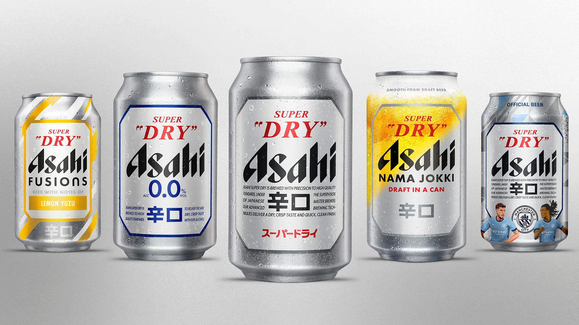
Elevating Japan's No.1 Beer
Asahi Super Dry
Crafting global packaging and brand world for Asahi Super Dry
As their global portfolio grew, Asahi Super Dry wanted to ensure their brand world continued to present a differentiated and consistent look – not a fragmented one.
We adopted three key design strategies to help them achieve their vision:
1) PREMIUMISE the Asahi Super Dry packaging
2) Elevate the unique ‘SUPER DRY’ taste message
3) Adopt a modern, SILVER colour palette to create a unified global brand image
During the global packaging evolution, we refined the brand DBAs, heroed the taste statement, de-cluttered the design and moved from recessive black to a refreshing silver world – the most significant design update in almost 37 years.
Our progressive, flexible and future-proofed brand world was ready for anything, creating strong consistency for all packaging, from innovation products, like Asahi Super Dry 0.0%, to limited edition packs, like the Manchester City FC partnership.
"At Asahi Super Dry we never want to stand still. We want to continually look forward, to make our brand even more premium and distinctive. That’s why we have united our entire portfolio with a silver palette, our heritage colour that defines our progressive DNA. This will create global consistency for all our packaging, now and into the future."


