
Brand worlds that endure: WRC
We’re celebrating 25 years of our brand world being used by the FIA World Rally Championship
It’s hard to believe, but the FIA World Rally Championship logo and brand identity is 25 years young this year. Still looking as distinctive and contemporary as ever, it was created back in 2001 as part of a bigger, strategic global brand refresh.
As a key member of the design team behind the original evolution, we’ve interviewed Gary Westlake, Creative Director here at Purple, about how the WRC logo, design system and brand world were brought to life and what inspired the work.
But first, let’s get a bit of context...
Going back to the start line
Since its peak in the 1970s, The FIA World Rally Championship was increasingly neglected and had become one of the last great under-exploited sporting properties. In August 2000, Bernie Ecclestone sold the TV and commercial rights of WRC to a consortium headed by the ex-Rally World Champion, David Richards.
Creative agency 23red were appointed to overhaul the brand, create the brand’s marketing strategy, act as brand guardians and develop and deliver integrated marketing communications campaigns. The challenge was to redefine World Rally as a global sports entertainment brand.
The first task was to develop a motivating, coherent and adaptable positioning and brand architecture – a handle for stakeholders, and ultimately consumers, across all media channels.
23red commissioned us at Purple as strategic design partners to help bring the corporate identity side of the project to life. This is where Gary picks up the story:
“Before we put pen to paper, it was important we were properly immersed in the sport. I’d followed Rally on TV of course but was lucky enough to be invited to WRC races in Monte Carlo and Wales. The events were similar in some ways, but so different in others. That was a fascinating aspect of the WRC that really inspired the work.”
A new logo for a new era
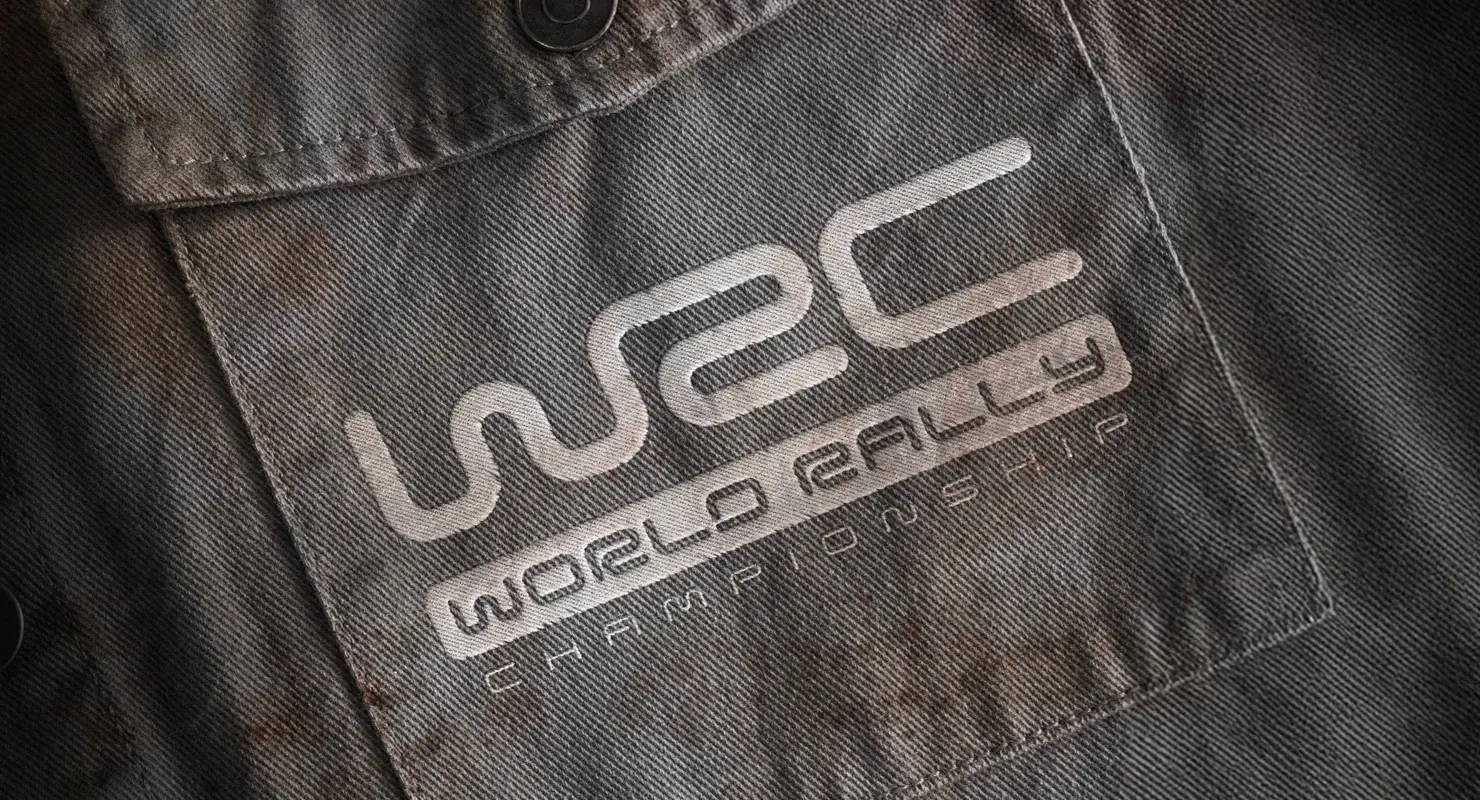
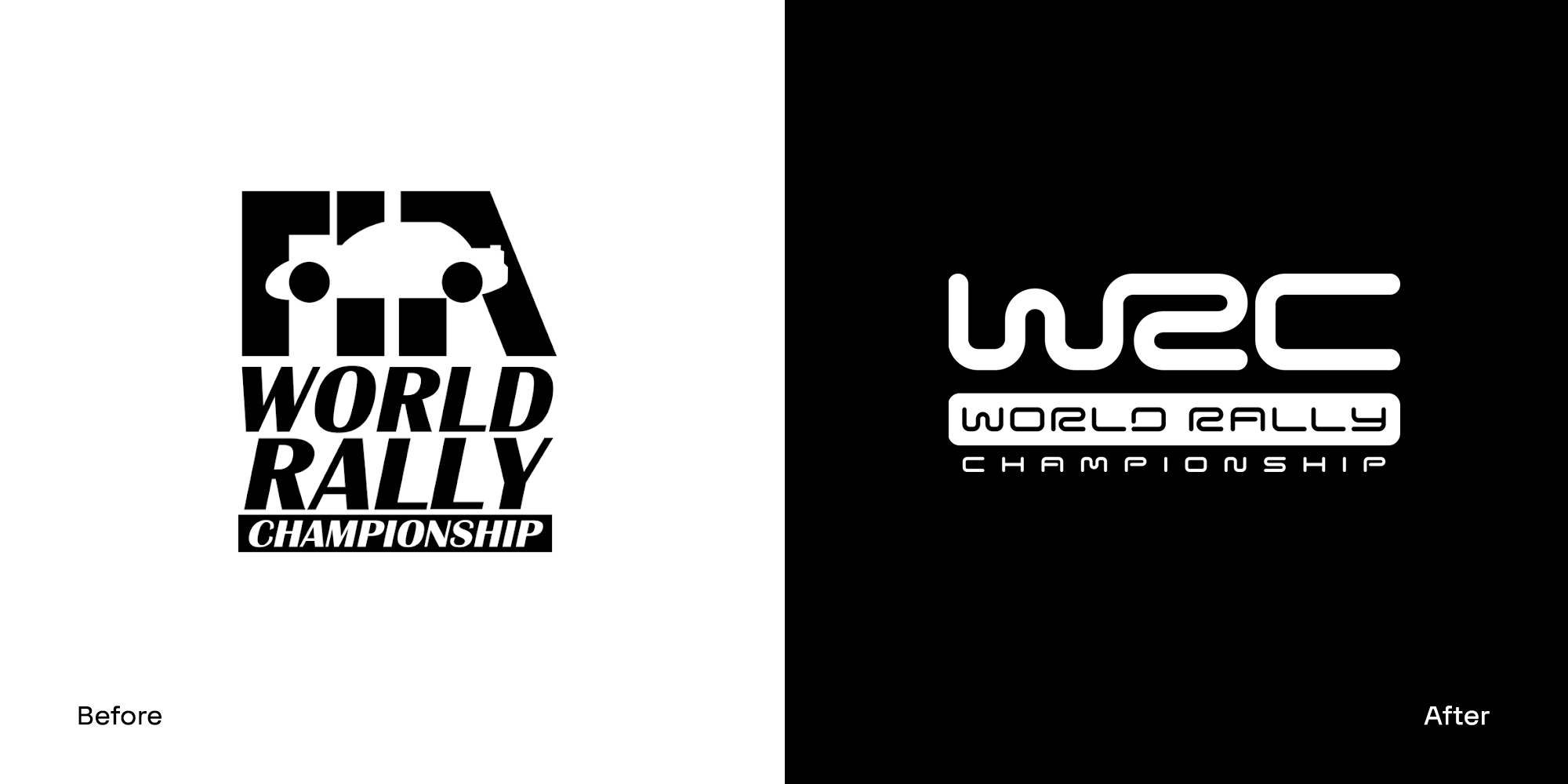
“The old WRC logo featured a boxy rally car. We wanted to be OEM neutral, so the depiction of a car was dropped.
Our new logo was inspired by the race line and all the epic, unexpected and continuous flowing corners that are the centrepiece of every race. We found a brilliant quote from a rally fan on a New Zealand web forum, which guided a lot of our early thinking: ‘F1 is going around the same corners thousands of times, WRC is about going around 1000 different corners once’.
At the time, the sport was a kaleidoscope of colours, with teams, sponsors, race terrains and nations all competing. So, we decided the logo needed to be black and white, allowing everything else to be amplified from this neutral background. On a more serious note of safety, the only colour palette we had was safety colours for signage, clothing and warning information. Silver was used for higher-end hospitality but was still coming from a neutral stance. We wanted the logo to be simple and iconic too, so it could be as useful and flexible as possible in a sporting, merchandising and sponsorship landscape. As well as appear on a PlayStation game cover. And jump out of an all-action editorial image. And be distinctive on a moving TV ident. Basically, it had to perform at its best everywhere, in all channels and environments, just like a rally driver.”
Celebrating the yin and yang
“The more we delved into the sport, the more inspired we got. There were two key contrasting factors to the sport that got us excited. Before the light changed at the start of a rally, everything was controlled – the team strategies were rehearsed, the cars were clean and finely tuned, everything was perfect, high-tech and calm. Then when the light changed, everything became unpredictable. Mother nature can throw down the worst weather to challenge drivers, the terrain is unforgiving, cars are compromised miles from support. This is what makes the sport so exciting. That's what we wanted to capture in the visual identity.
So, we used these contrasts as a differentiator. Simple ideas such as clean and dirty, black and white, passion and precision. The snow of Norway and the heat of the African bush. The gravel of Greece and the mud in Wales.
A brand is more than just a logo, and this thinking went across the photography and illustration styling and tone of voice. It was these principles that were used to inspire photographers and the film teams, to capture the unique differences of WRC in every location the rally was held.”
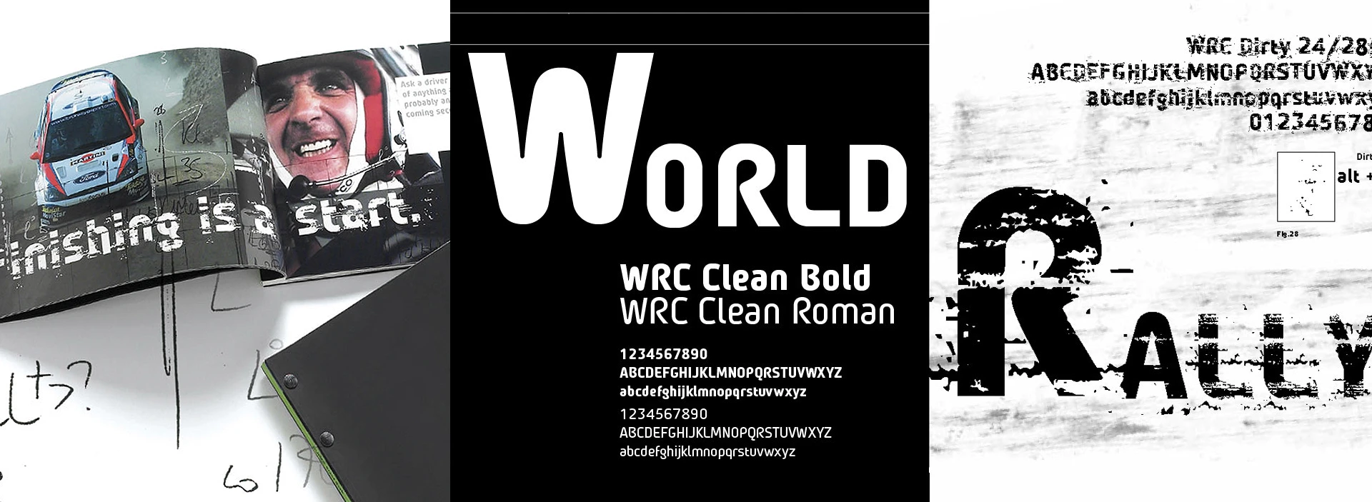
WRC Clean and WRC Dirty fonts
“Just like today, one big challenge for any global brand is consistency. Not every partner, printer or content provider will buy and licence the correct typefaces – and so they use what they like. This creates inconsistency across the world, across different touchpoints, and that’s not how you build a strong brand.
We created two fonts, WRC Clean and WRC Dirty and they were provided to official partners and suppliers free of charge to ensure they were used. The font embodied the yin and yang of the sport best, those epic contrasts, so we would use a dirty font on a clean car and vice versa, a clean font on a crashed car in mud.
The Dirty font was designed to represent the extreme aspects of the sport, the mud, snow, action and passion of the fans. Basically, all the more unpredictable parts of WRC.
The Clean font was more precise, and clean and technical, representing the technology and engineering heart of the sport, and used on the championship standing tables on TV and digital amongst other things.”
A brand that’s distinctive everywhere
“From a distinctive brand logo to the typefaces, tone of voice and the design system, the photography and videos of the action. Combined with the passion and vision of real brand guardians, with the determination to ensure the WRC acted as ONE BRAND whenever it showed up. I like to think the WRC is a blueprint for how any brand should operate if it wants to endure for the long-term, whether it’s in motorsport, or any other sector.”
The evolution of an iconic brand
“I’m really proud of the work we did back then. Collaborating with 23red was great fun and we learnt so much as a creative team about how to build a global brand.
I know there have been tweaks and evolutions of the years, but the foundations of the brand look as distinctive as ever. Seeing the teams on the podium last season, it’s hugely satisfying to think that we played a small part in the evolution of such an iconic and exciting brand.”
Discover more about the FIA World Rally Championship: www.wrc.com/en
Find out more about 23red: www.23red.com
A big thank you to WRC for letting us use their images.