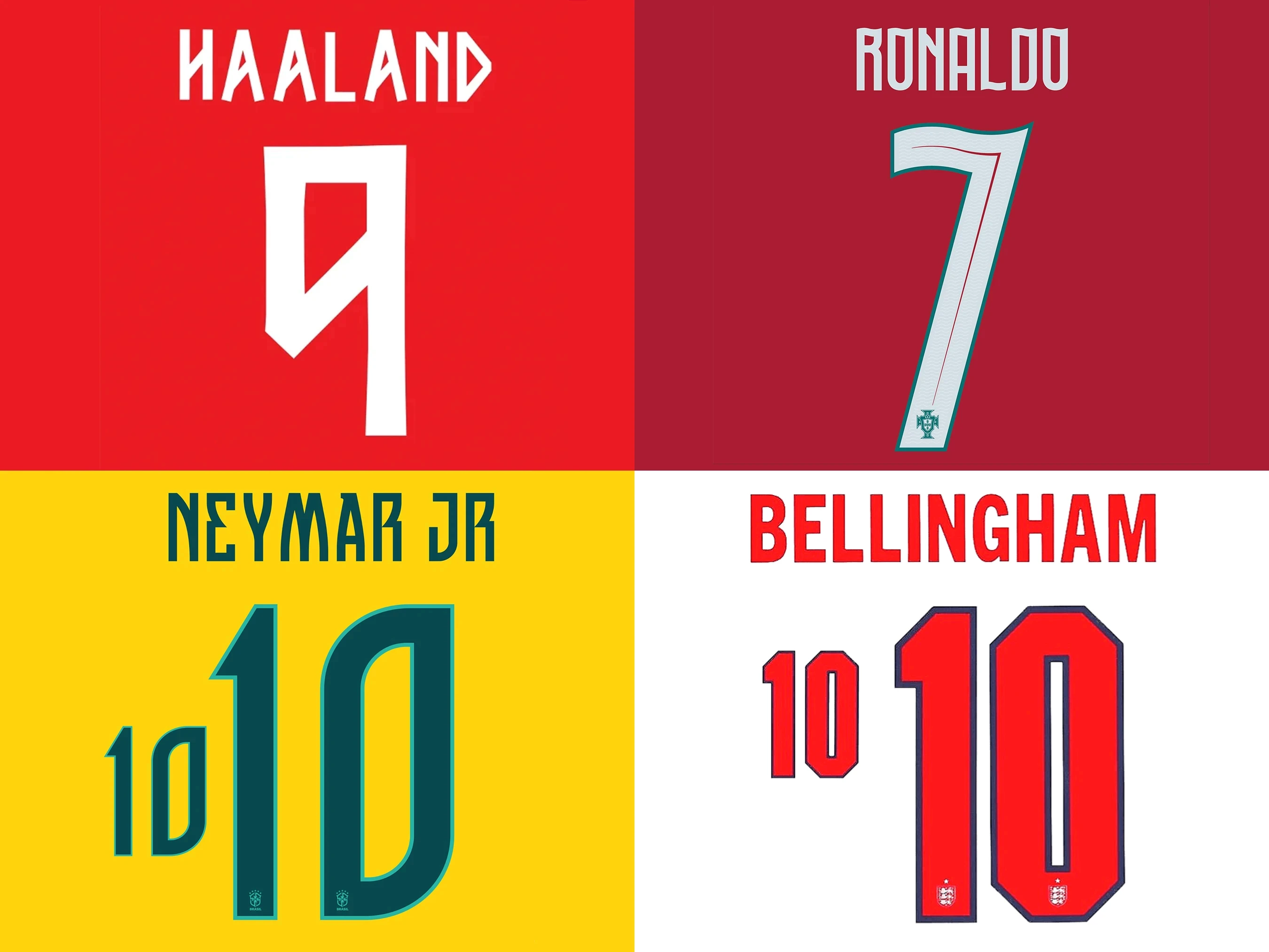
The fascinating fonts at the FIFA World Cup
FIFA, football & fonts. We go deep on shirt typography.
How come people so rarely discuss typography in football?
In the design world, it’s usually the team badge that gets all the plaudits. Or the vibrant colour combos of the away strip. But the fonts are seldom studied or celebrated.
So, it’s rather exciting that the FIFA World Cup 2026 has become arguably one of the largest international showcases for bespoke typography in the world. Every single match is a live demonstration of how letterforms perform under floodlights, at speeds of more than 20mph, viewed from the top tier, through drone cameras, in driving rain and under the scorching Texas sun.
Unlike FIFA's official branding, which uses its own 2026 visual identity with ruthless consistency, there’s no single mandatory World Cup shirt typeface. Instead, federations and manufacturers like Nike and Puma have developed custom lettering systems that reflect the identity of the national teams they’re creating for.
It's one of the few areas where graphic design, manufacturing, branding and elite sport intersect – and the results are incredibly diverse and endlessly fascinating.
FIFA does regulate, of course, but it’s for performance, not style. Things like visibility, dimensions and placement rather than a unifying font. If you’re interested, back numbers must measure between 25 and 35cm in height, stroke widths between 2 and 5cm and player names measuring between 5 and 7.5cm high.
Designers can riff the rest. Fonts, outlines, shadows, contrasting borders, decorative elements, geometric textures, motifs and subtle cultural references are all totally acceptable.
With that in mind, we’ve picked some of our favourite typefaces from the FIFA World Cup 2026.
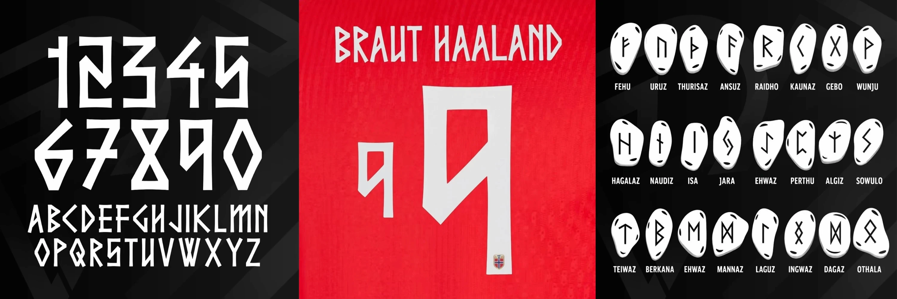
Norway
Nike have created a bespoke Norwegian alphabet which draws inspiration from the Elder Futhark, the oldest known Norse runic alphabet that dates back nearly two millennia. But rather than literally recreating the runes, the design abstracts their geometry, so every character appears carved in stone rather than written.
By extracting the underlying design language – the facets, the angular terminals, the diamond-like intersections – the designers have evoked Viking craftsmanship without sacrificing legibility. And there are no decorative flourishes here. It’s all purely structural. A typeface that never forgets it’s a modern sports font first.
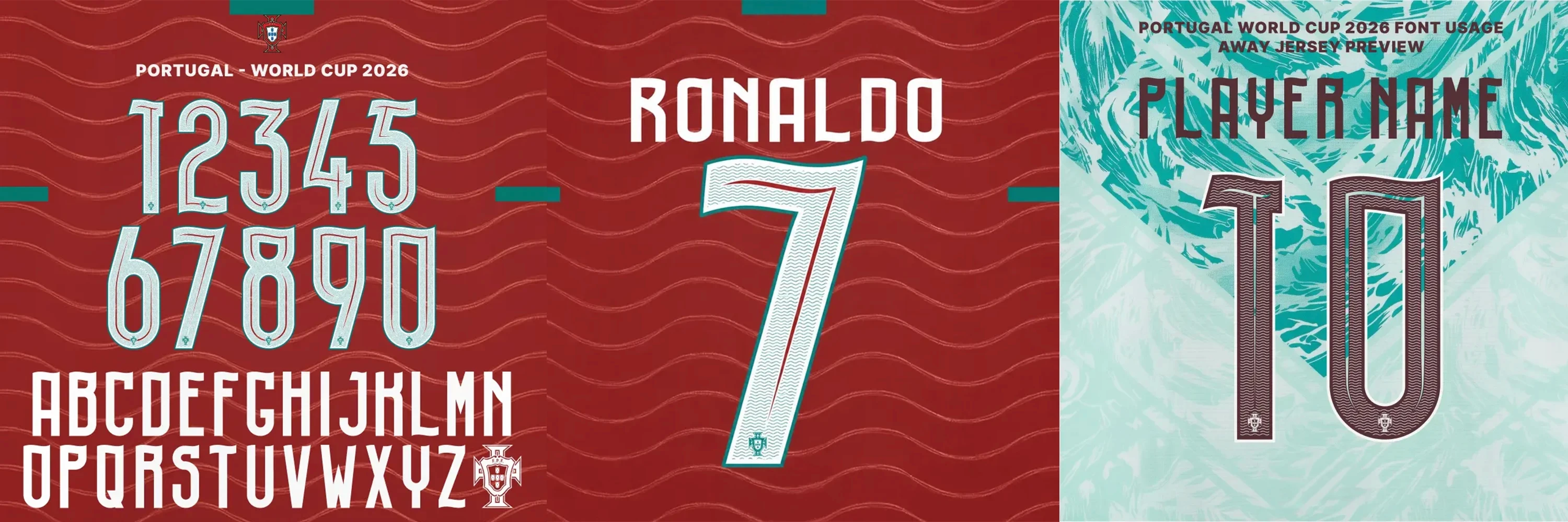
Portugal
Puma’s lettering for Portugal takes an entirely different approach, embracing movement and rhythm rather than rigid geometry. The numerals feature flowing curves that suggest ocean waves, wind-filled sails or the movement of a flag. An appropriate metaphor for Portugal, of course, one of history’s great maritime nations.
The flowing forms soften the aggression of the modern sports font – none of the transitions feel abrupt, instead using curves to guide the eye through each numeral.
The result is a typeface that feels elegant and full of personality without losing clarity.

Brazil
Nike’s lettering for Brazil reflects many of the qualities traditionally associated with the nation’s football. Confident. Balanced. Energetic.
The font uses a bold, streamlined construction built around confident proportions rather than too much ornamentation. Sharp edges are carefully balanced by generous internal spacing and clean proportions, so the type doesn’t feel cramped. The result feels contemporary and timeless at the same time.
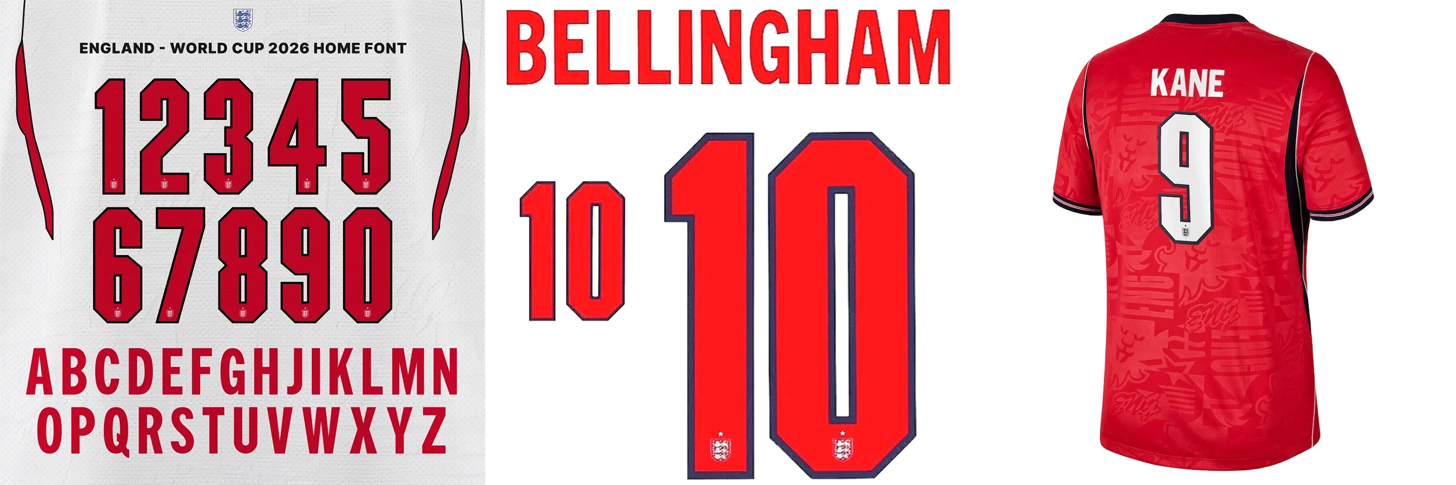
England
England's World Cup font is perhaps the most understated of the tournament. Where modern football meets heritage and tradition. The block construction recalls classic English football typography from previous decades, showing how nostalgia can be contemporary.
But rather than simply reproducing vintage lettering, the designers have modernised the proportions. Larger counters. Improved stroke consistency. Refined corners. It makes the type feel reassuringly familiar without becoming a pastiche.
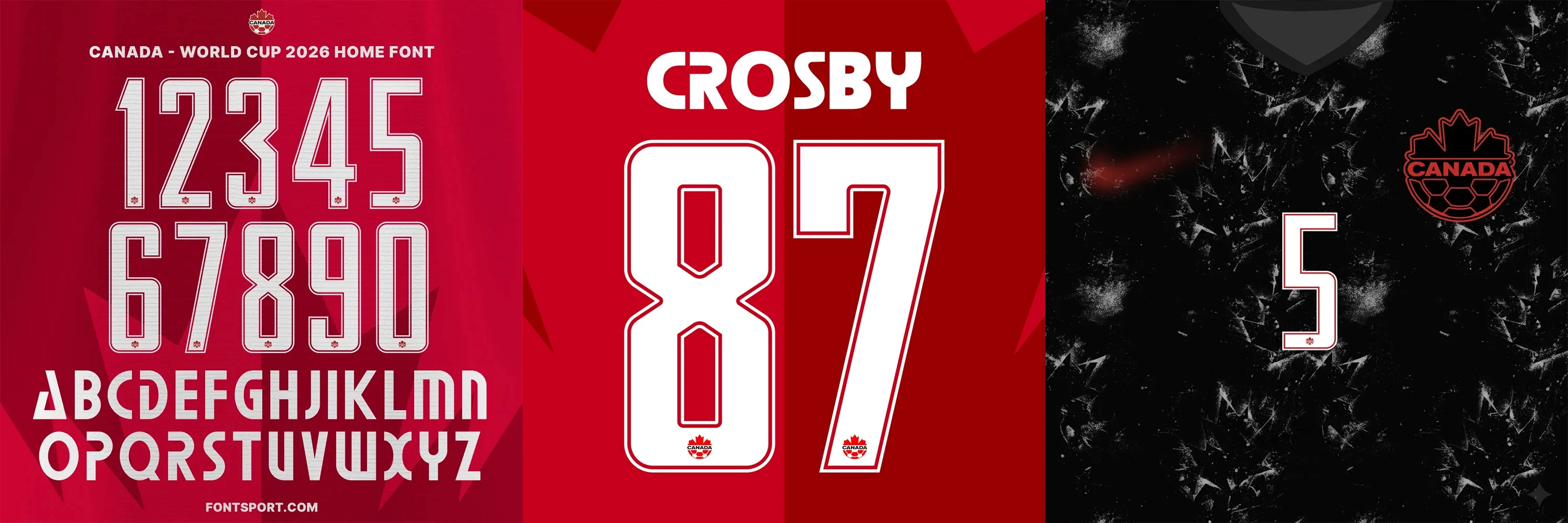
Canada
Canada's lettering demonstrates how typography can communicate national identity. Rather than relying on oh-so-obvious maple leaf graphics, the custom typeface incorporates angular triangular cuts inspired by the geometry of the leaf itself.
It's elegant symbolism, a Canadian identity built directly into the skeleton of each character.
The FIFA World Cup 2026 suggests that football shirt typography has truly come of age. It's no longer a novelty or an afterthought. Instead, it's become an important part of a team's visual identity and a powerful way of expressing national character and cultural heritage.
We hope you’ll never look at a football shirt in quite the same way again!