
Creating a world of colour like no other for Chameleon
Chameleon Art Products are transforming the traditional art industry with their unique range of art materials. Inspired by the brand’s visionary philosophy, we put their innovative colour-blending technology at the heart of a new brand world.
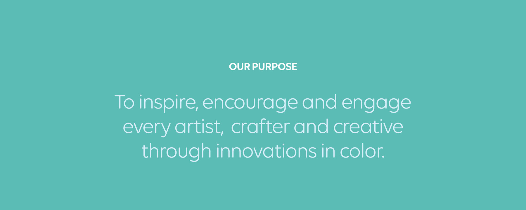
We defined a new purpose, built a new messaging architecture, designed a bespoke gradient typeface and created guidelines to show how these assets should be blended together to make Chameleon stand out. The result was a vibrant brand world that invites artists, creatives and crafters into a world of colour that is truly like no other.
Brand world | Bespoke typeface | Brand guidelines


“This project is far more than just a visual rebrand for Chameleon. It’s a brand world restructure to showcase that our products are different to anything else on the market - and that we’re thinking differently to everyone else in the art materials industry.”
300%
increase in online sales
30,000
new social subscribers
221%
increase in website visits
Glenfiddich
Brand identity

Pilsner Urquell
Global brand guardians