
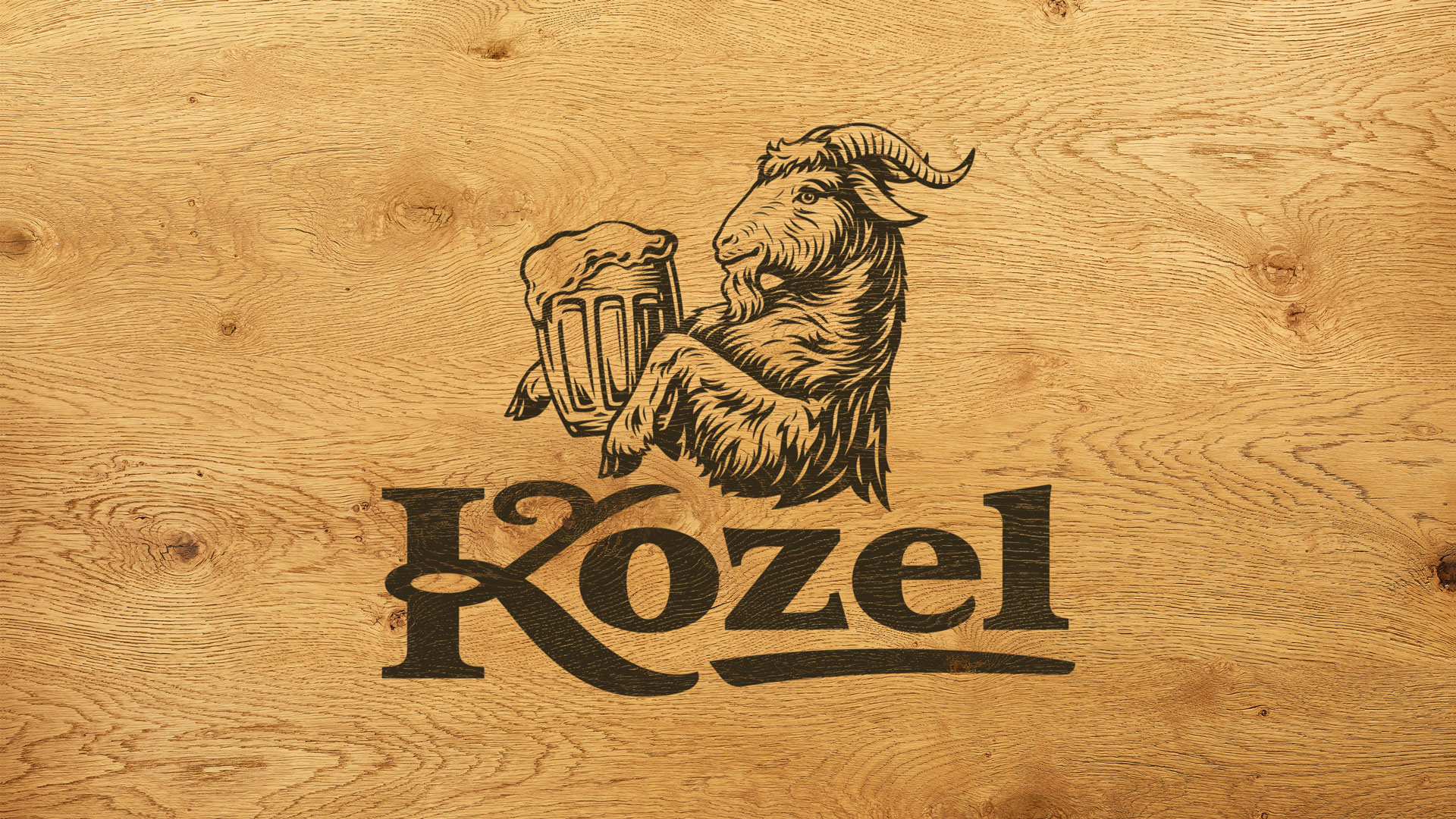
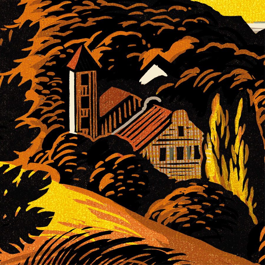
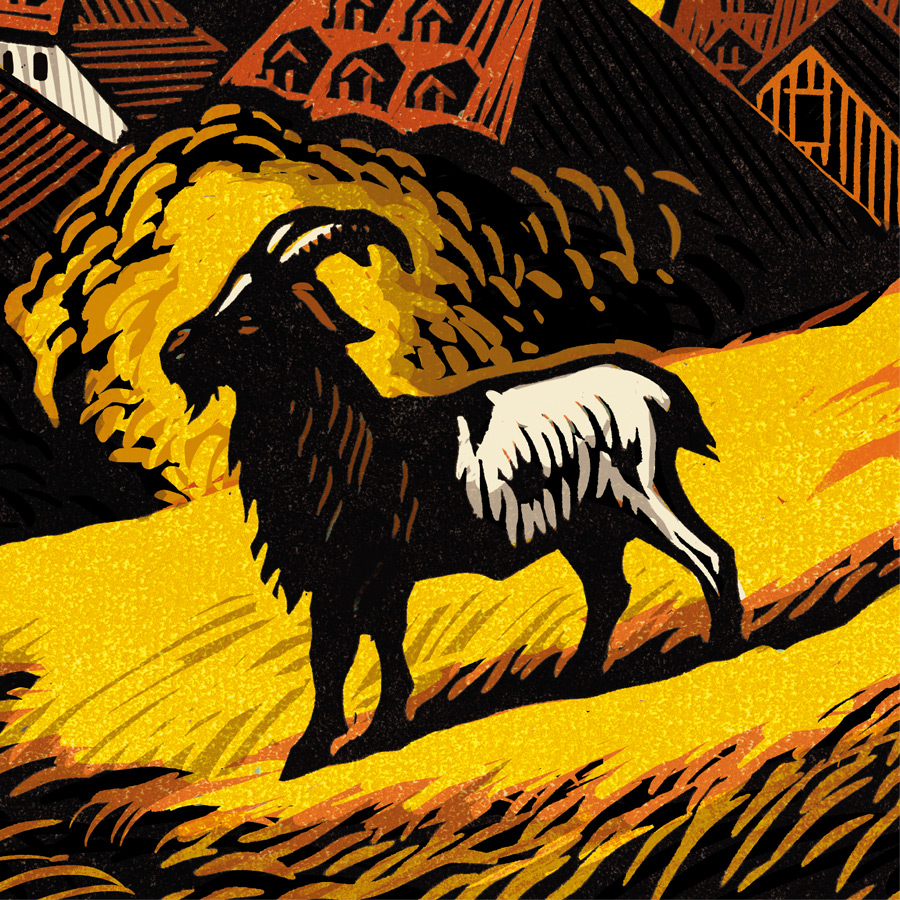
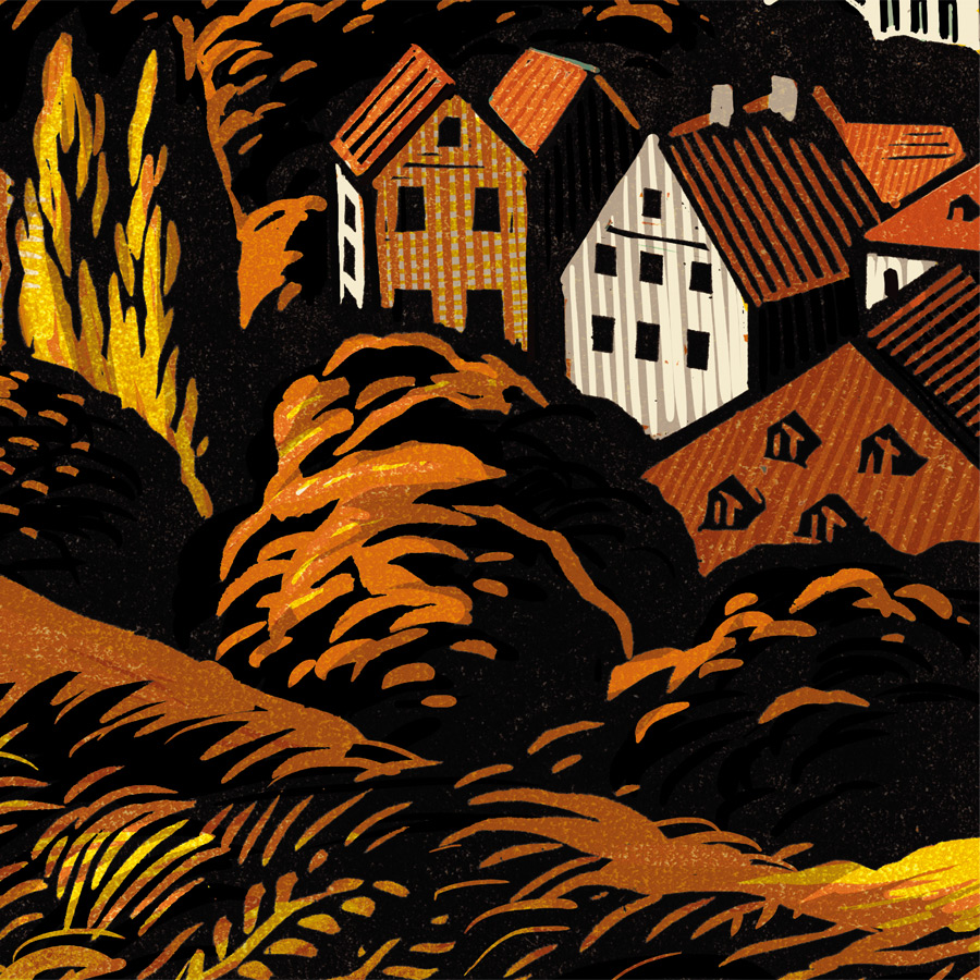
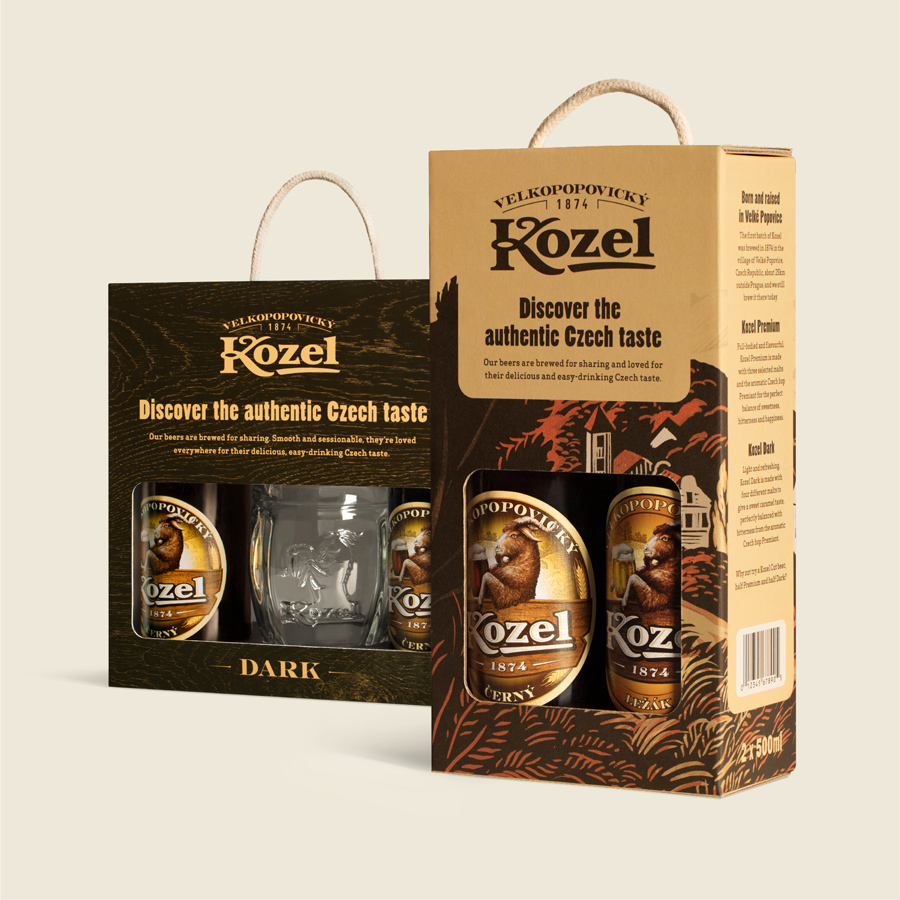
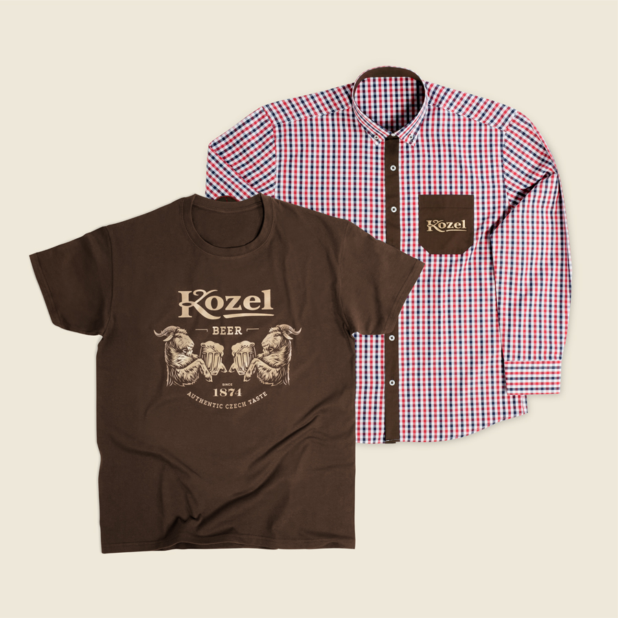
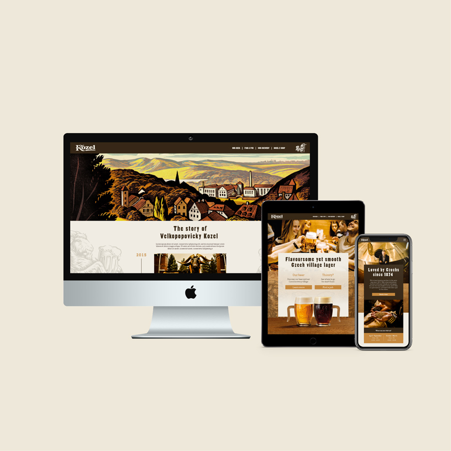
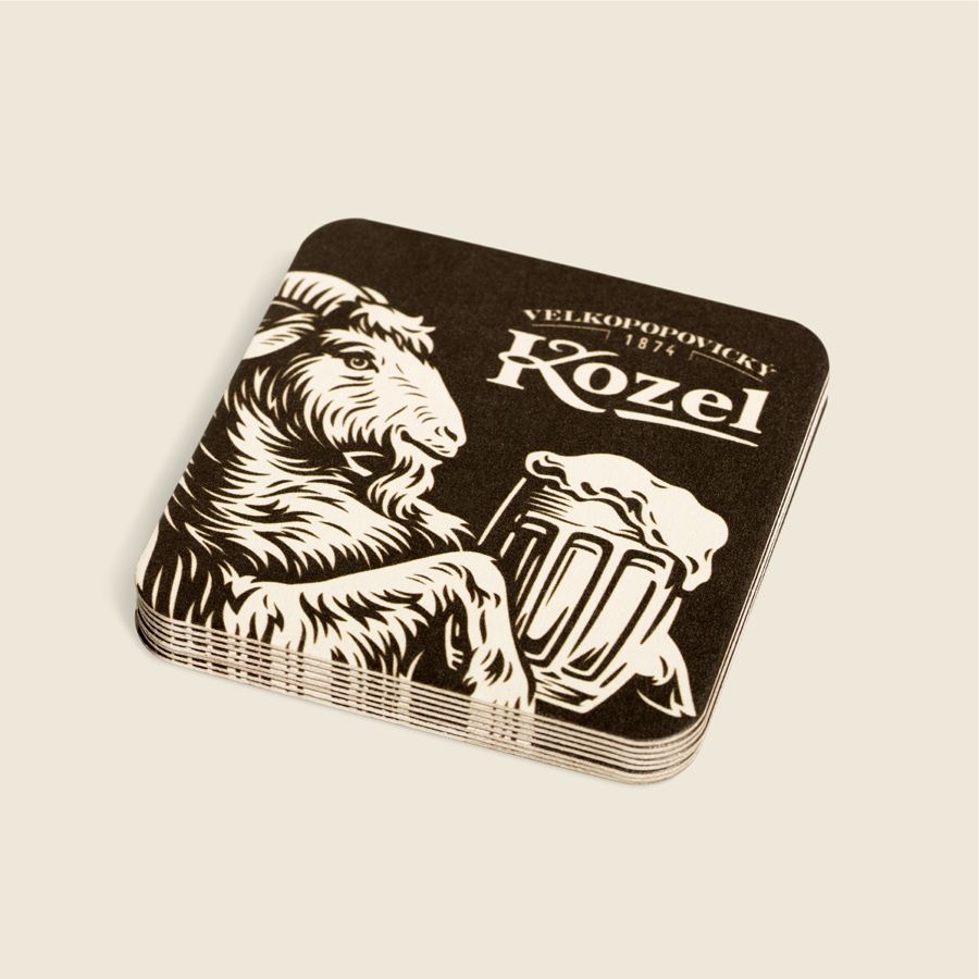
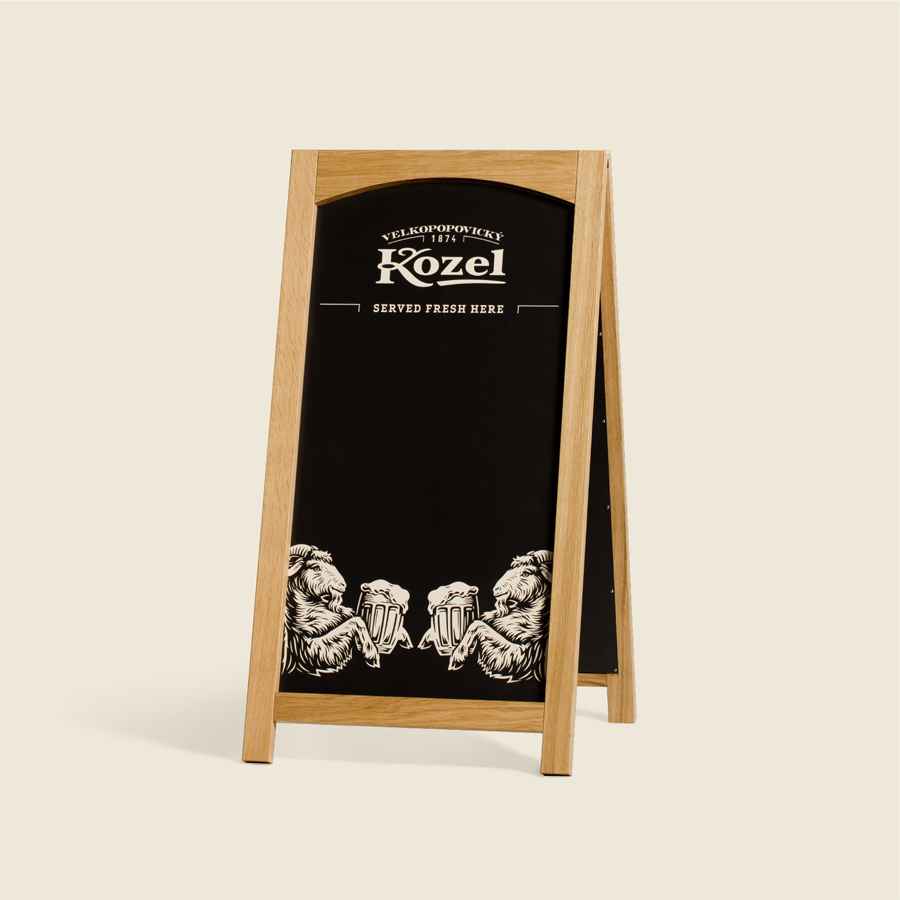
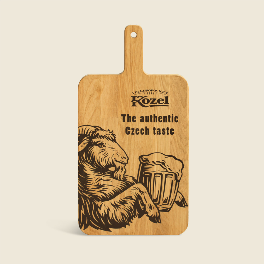
Re-energising Kozel’s brand identity
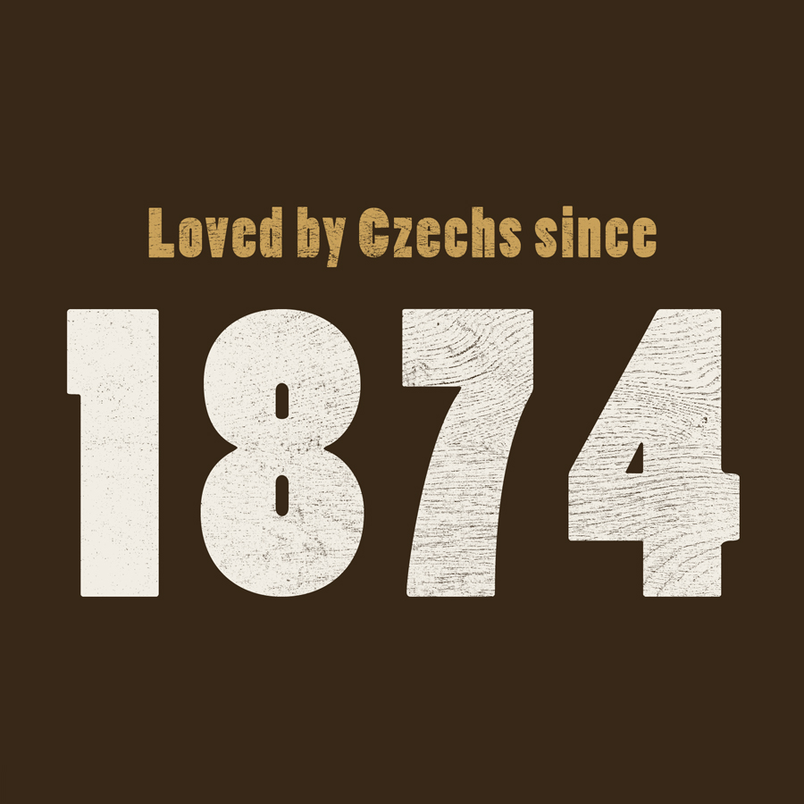
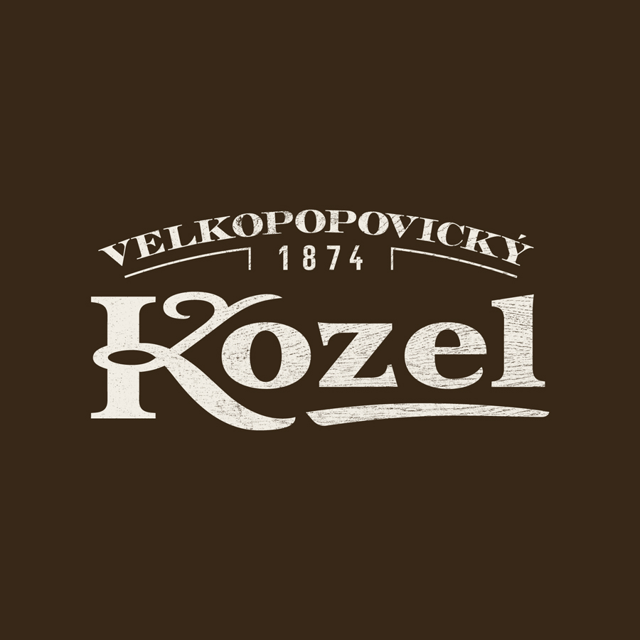
Kozel, which means goat, is a unique Czech beer brand bursting with personality. But its branding was starting to appear old-fashioned and rural – not symbolic of the world’s favourite Czech beer.
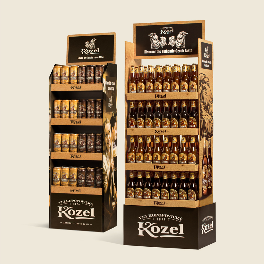
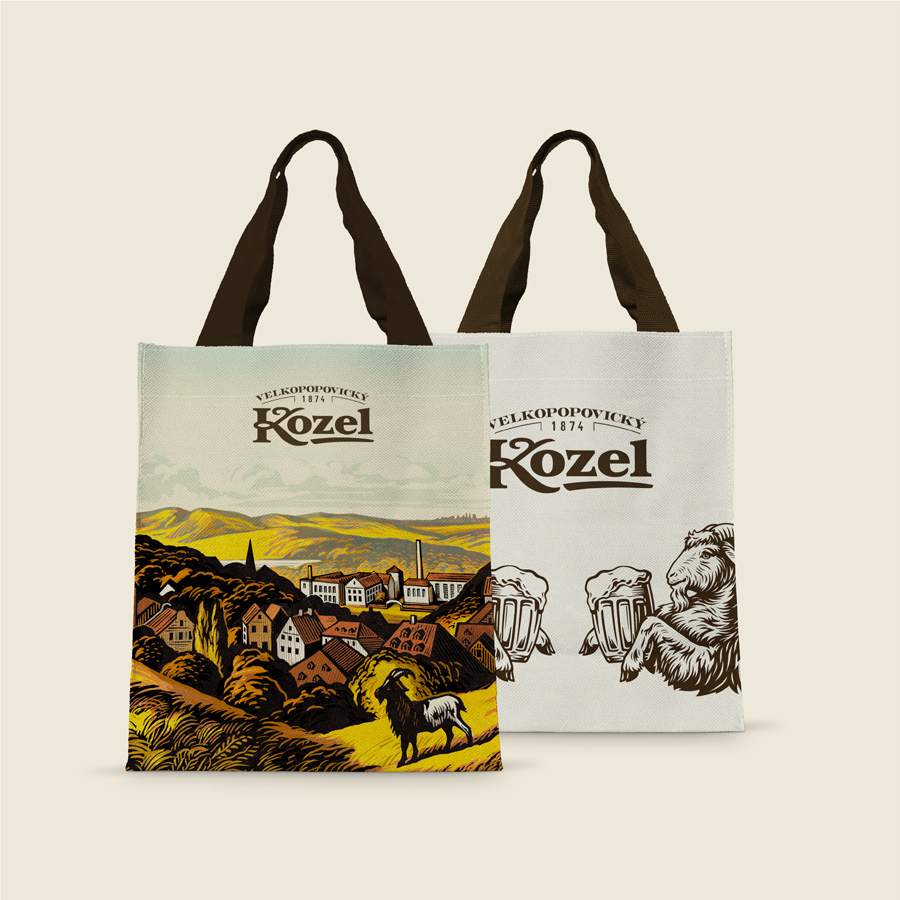
Purple were fascinated by the direction this playful, lively brand could take and we reinvigorated its identity to showcase the brand’s character and craft in a bold, fun and modern way. The result? Kozel is now seen as an approachable, premium brand rather than mainstream – allowing the business to raise its price in all markets.
Brand identity | Brand guidelines | Image library


Castrol
B2B brand identity

Pilsner Urquell
Global brand guardians
RNIB
Brand design