
Refreshing the brand world of an everyday Czech hero
Historically Gambrinus has always been one of the most popular mainstream brands in Czech Republic, but its reputation and appeal amongst its core male audience nose-dived around a decade ago. Outdated branding and a low-quality stigma meant it was losing volume, value and brand equity fast.
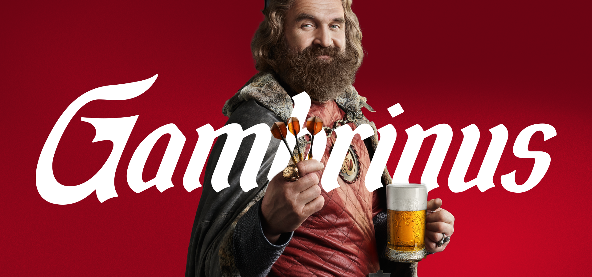
We were asked to spark a new Czech beer evolution, putting the Gambrinus icon at the heart of the brand world. As the patron saint of beer, we crafted him anew to give him more stature and confidence to resonated with our Czech audience. We added charisma and masculinity to enhance his legendary reputation and raised his beer glass which always overflows with creamy foam.
Brand world | Packaging


Besides the icon, the Gambrinus word mark was tweaked to be more modern and minimal (but still retain a sense of craftsmanship) and the red-focused colour palette premiumised to allow flexibility with a selection of graduations that can be used across all brand channels.
The cumulative effect of the changes has had a profound and progressive effect on whole perception of the brand. It’s modern, relevant and confident again, ready for the future.


That’s fascinating…
Historical portraits of Gambrinus show him toasting with both his left and right hand in many portraits and engravings. When we evolved the icon, we went with a left left-handed toast, add balance to the celebratory scene as he says cheers and na zdravi to the future.
“The icon adds more stature, the brand colour is more eye-catching, the textural elements more crafted and the packaging stands out on the shelf more.”

Grolsch
Global packaging and brand identity

1800 Tequila
Brand campaign