
Shaping a new brand identity for RNIB
The Royal National Institute of Blind People (RNIB) wanted to use its brand identity to shine a light on its progressive and positive personality.
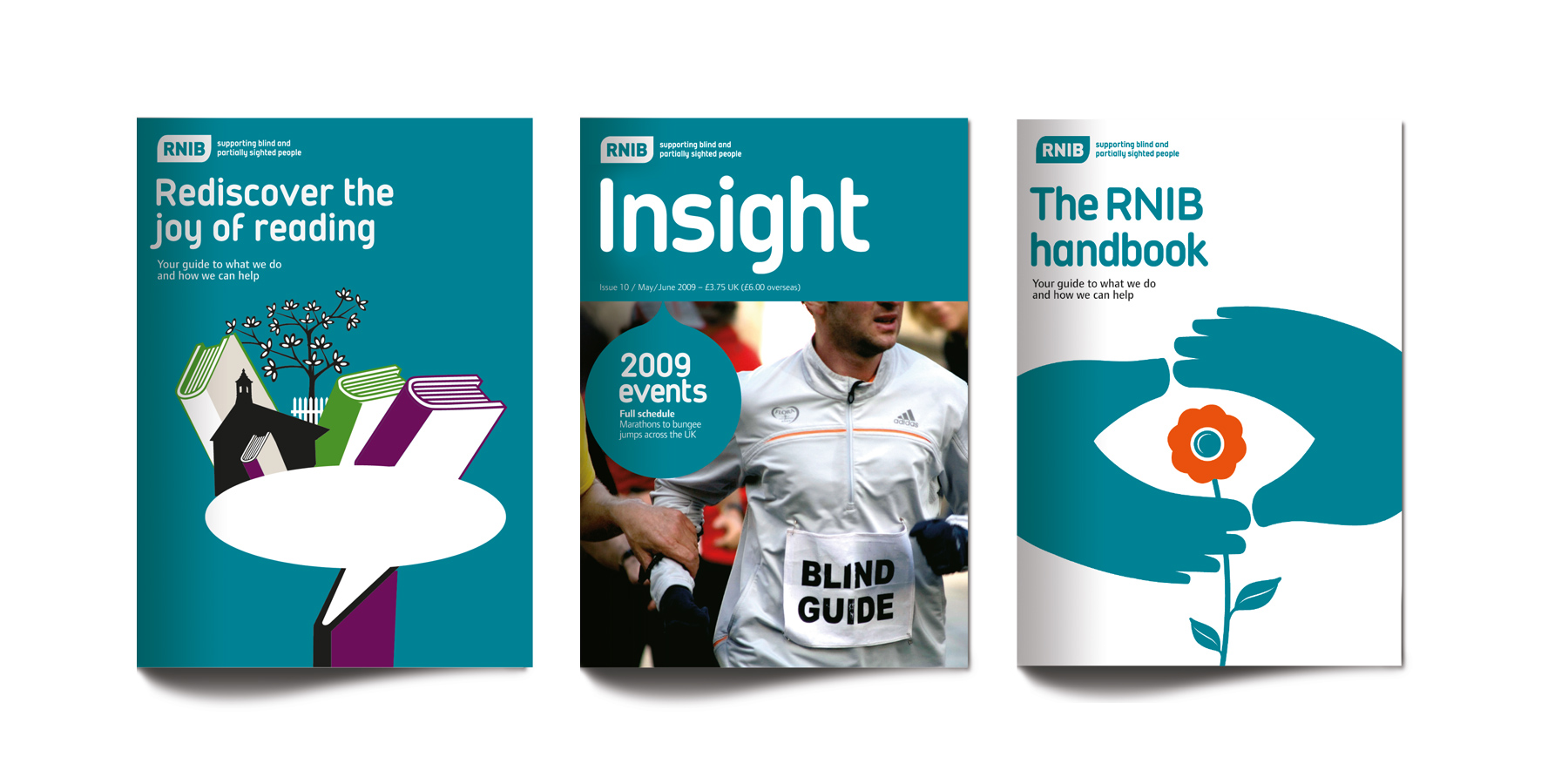
Purple designed a bold, clear and contemporary new brand identity, creating a bespoke typeface using characters and letter forms crafted to be more legible. We also developed a more conversational tone of voice and a new illustrative visual style and colour system to create warmth and character. The result is an inspiring and unified visual and verbal identity that’s modern, approachable and appeals to members and donors alike.
Brand identity | Typeface design | Brand guidelines


“Purple are just brilliant people to work with. They embraced the brief, but then pushed us further than we thought it was possible to go. But never were they precious or inflexible, just wanting to give us the best they had. The result is that our brand identity not only reflects our organisation now, but where we want to go in the future.”
Chameleon
Brand world
Castrol
B2B brand identity
CMC Markets
Brand identity